Cerave Rebrand
This project involved a comprehensive reimagining of CeraVe, aiming to present the brand as clean, approachable, and engaging while maintaining its reputation as a trusted skincare solution. The redesign included a brochure, product packaging, letterhead, business card, and envelope, all unified under a fresh and inviting visual language.
Each project phase began with research on the skincare industry, including competitor products, packaging styles, color usage, brochure layouts, and print ad designs. This research informed design decisions and helped establish a cohesive brand system. From there, iterative sketches and digital explorations refined typography, hierarchy, and visual structure to ensure consistency across all touchpoints. Along the way, we had multiple in-class critiques, which helped further refine my design.
This semester-long project focused on creating a brand identity that is both approachable and professional. By emphasizing clarity, cohesion, and trustworthiness, the redesign makes CeraVe feel more engaging to a wider audience while staying true to its science-backed heritage. Every element—from packaging to collateral—reflects a carefully considered and unified design system.
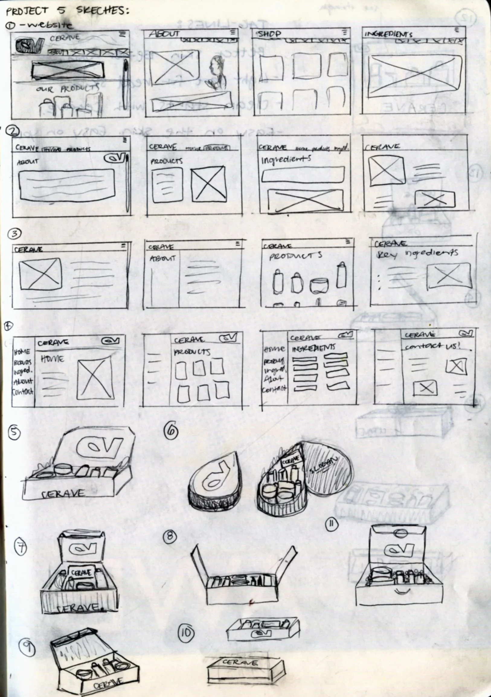
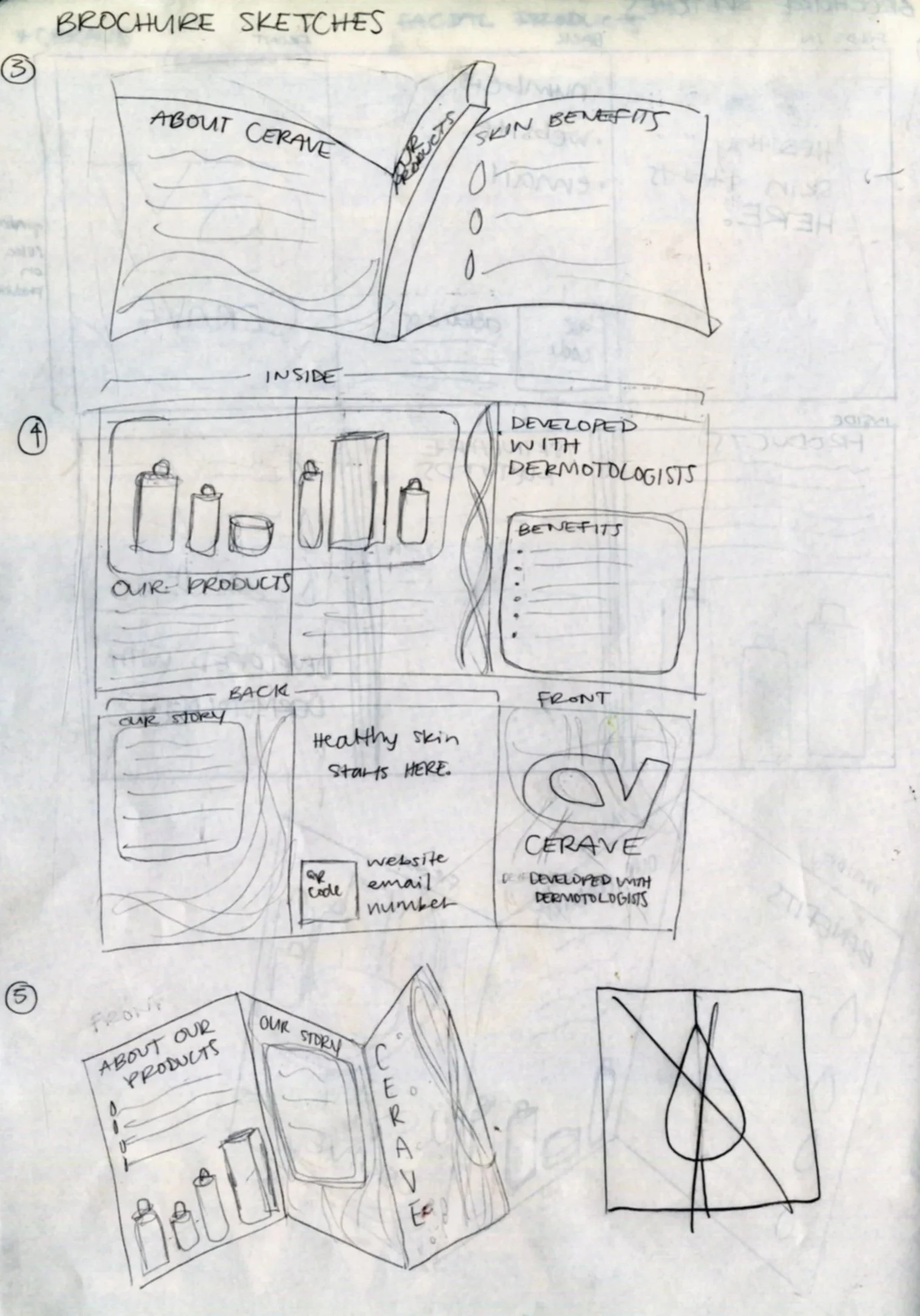
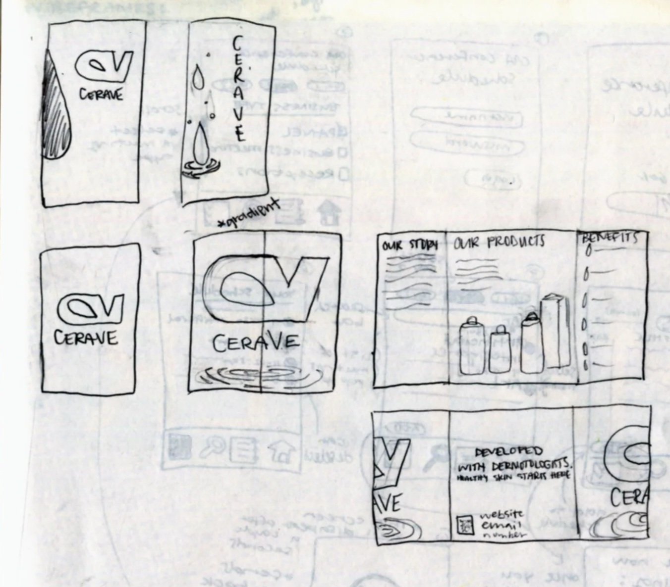
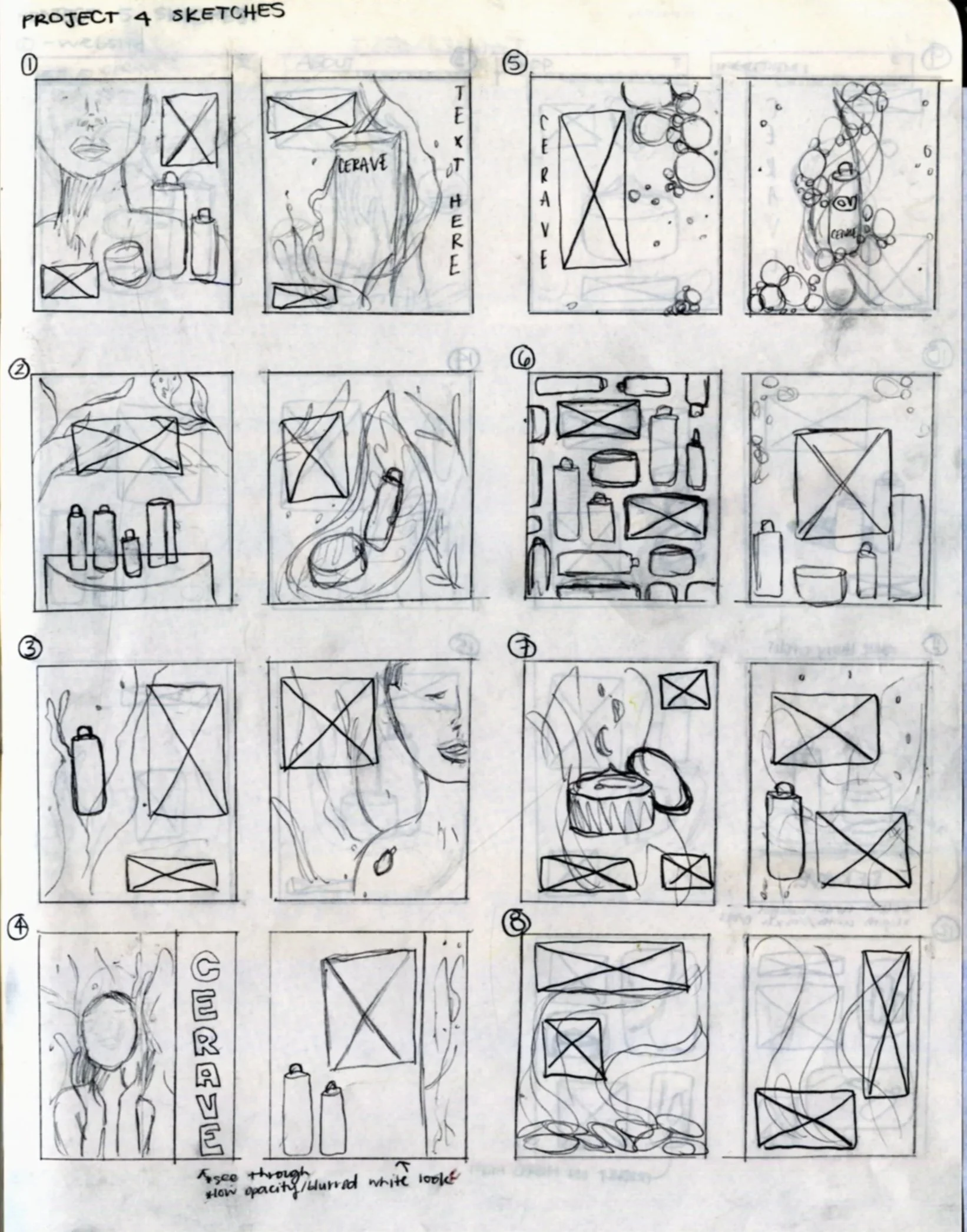
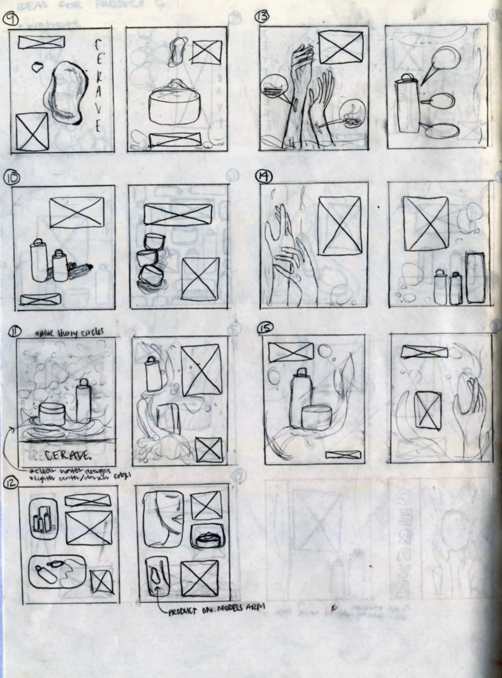
Sketches
Letterhead, Envelope, Business Card
Products
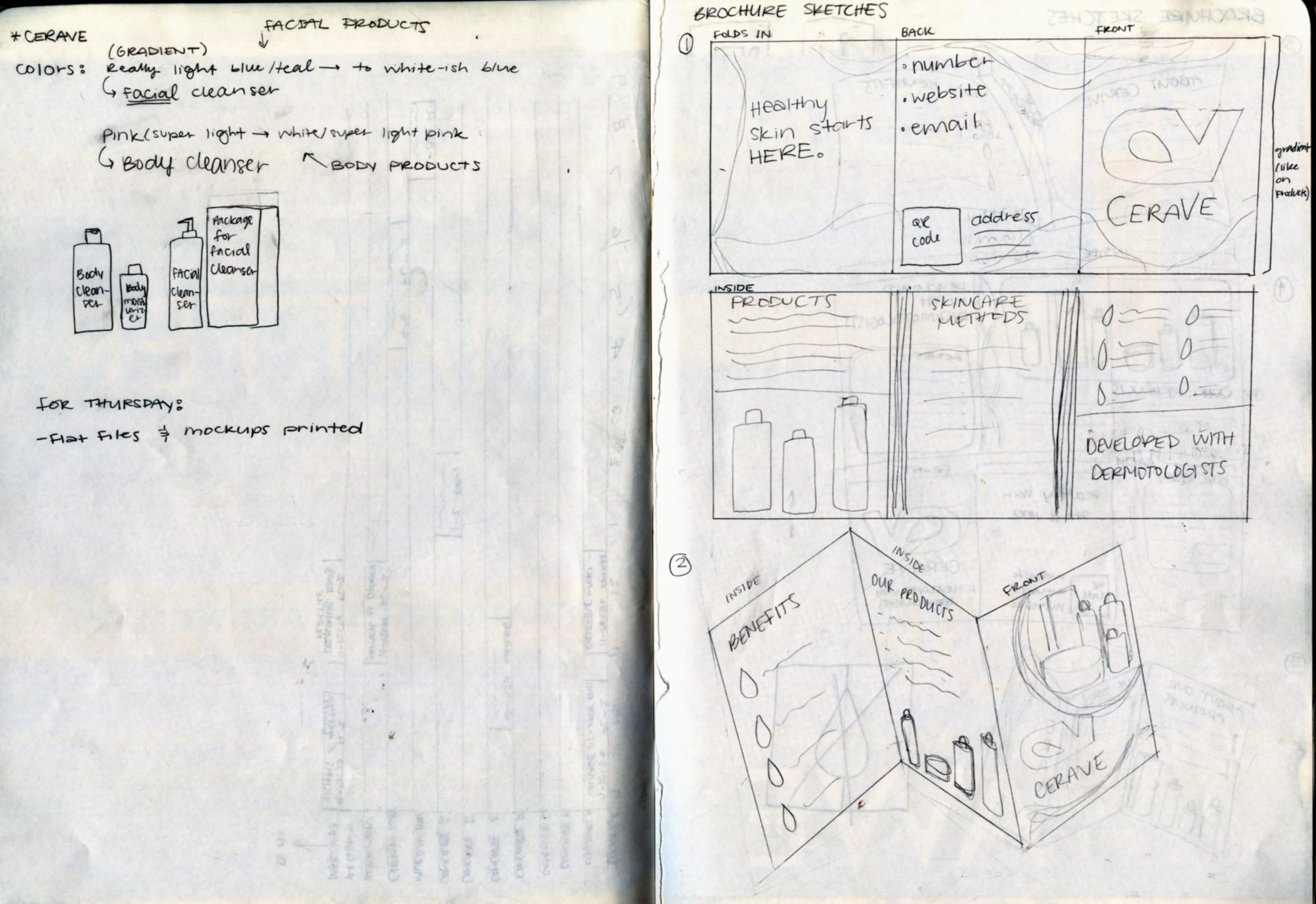
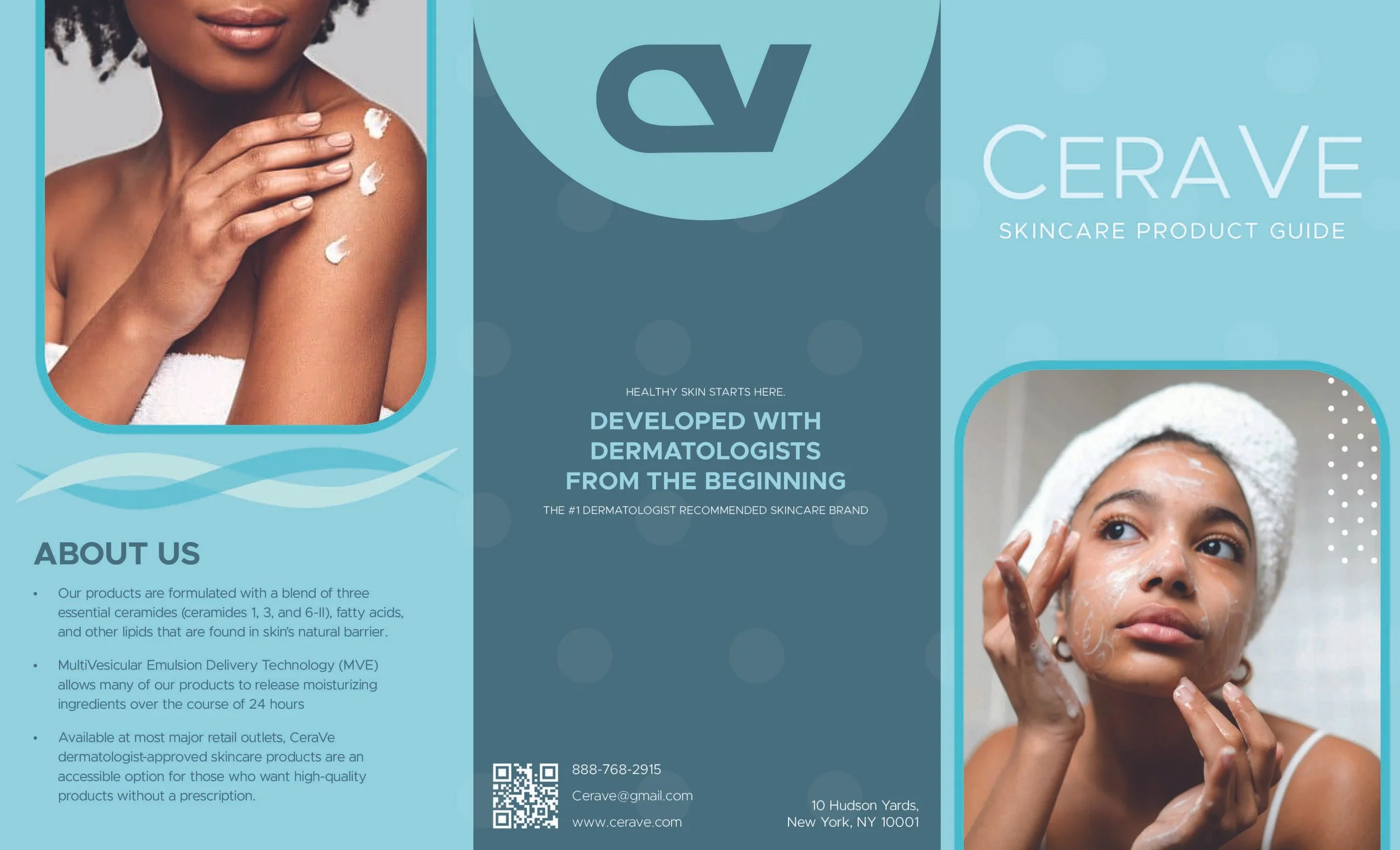
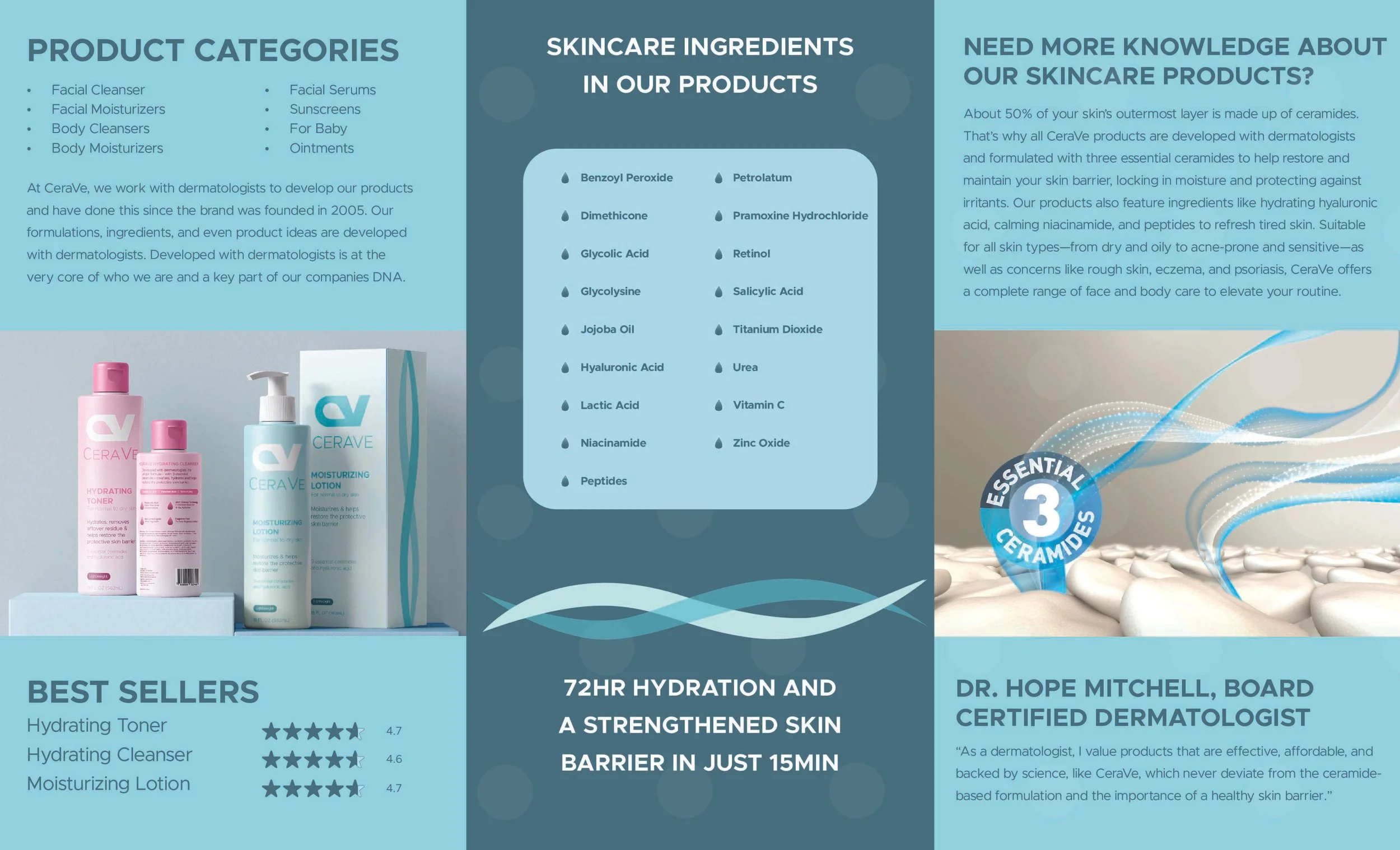
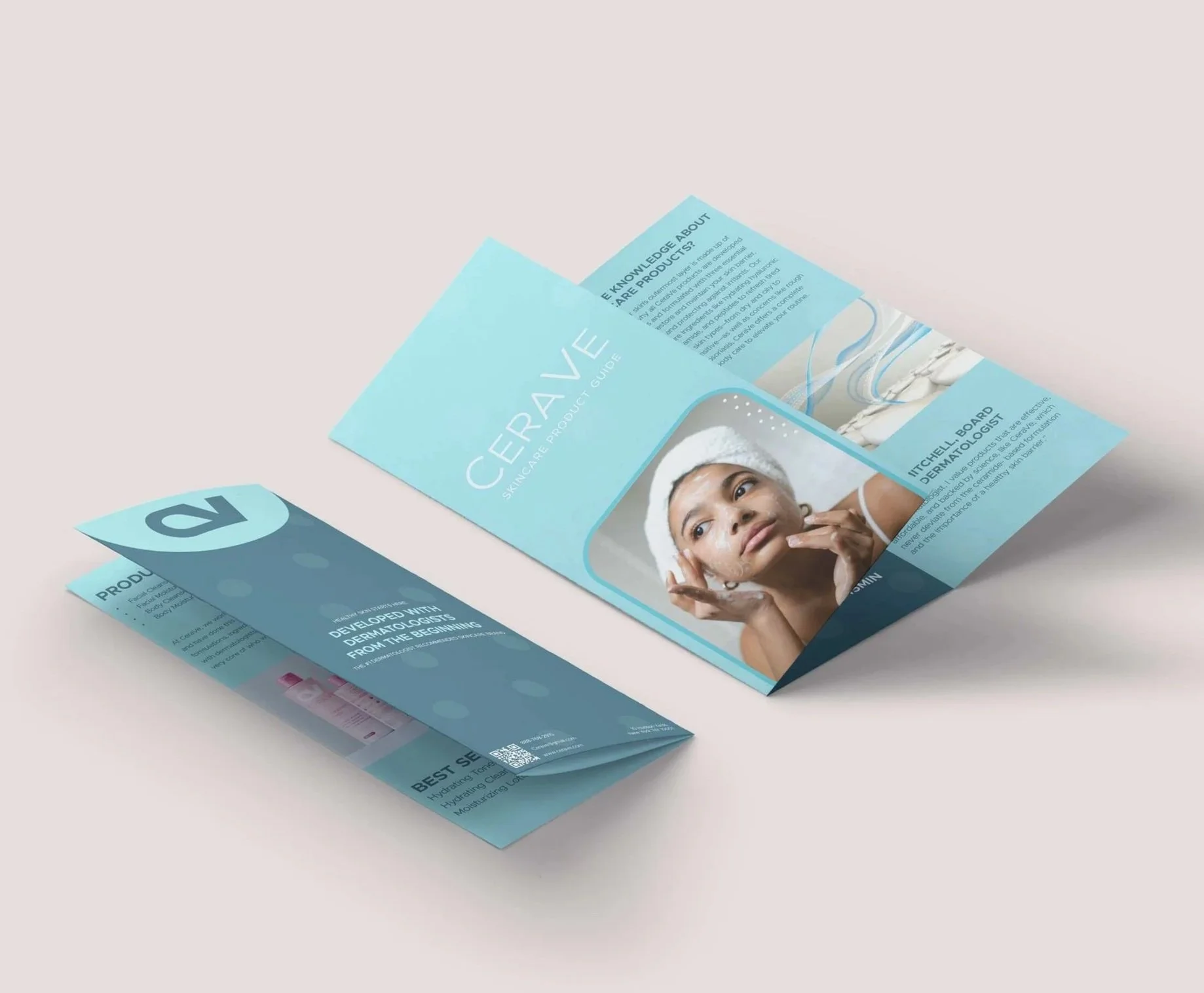
Brochure
Print Ads
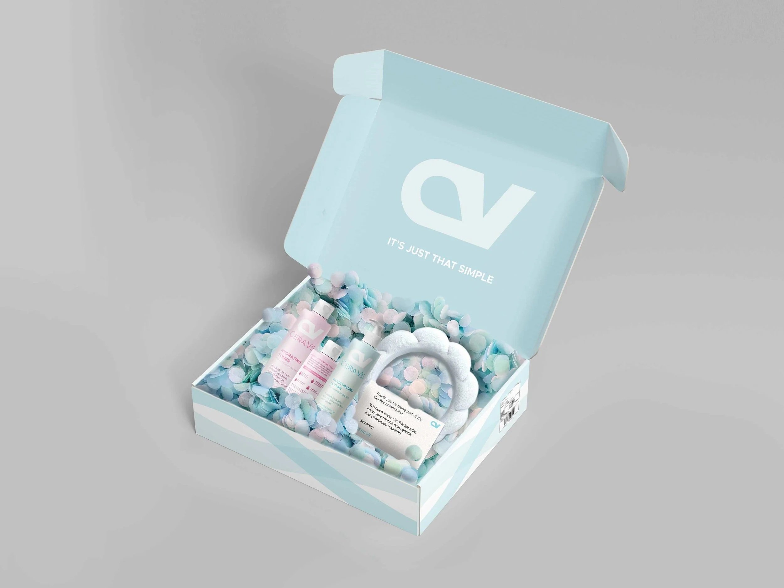
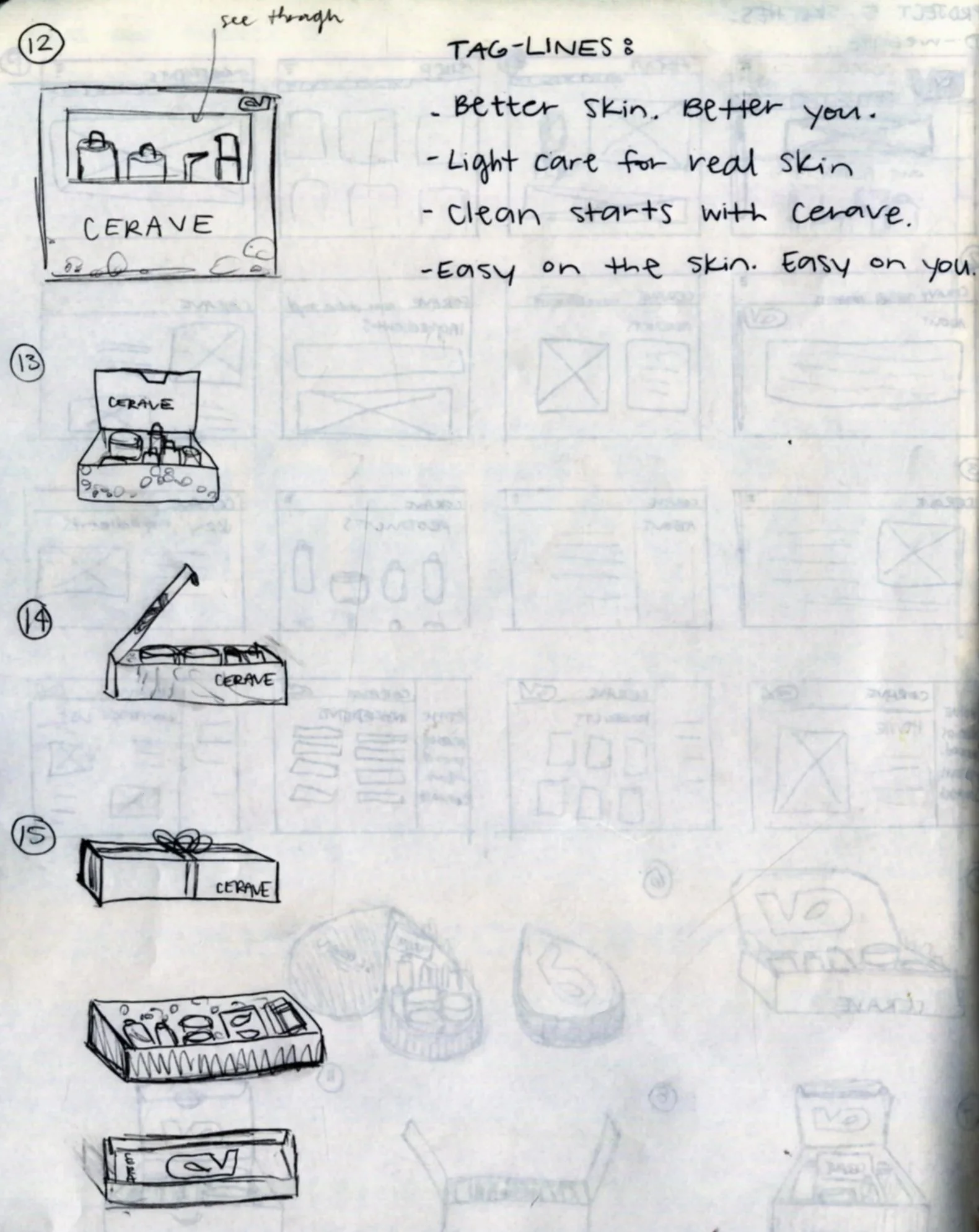
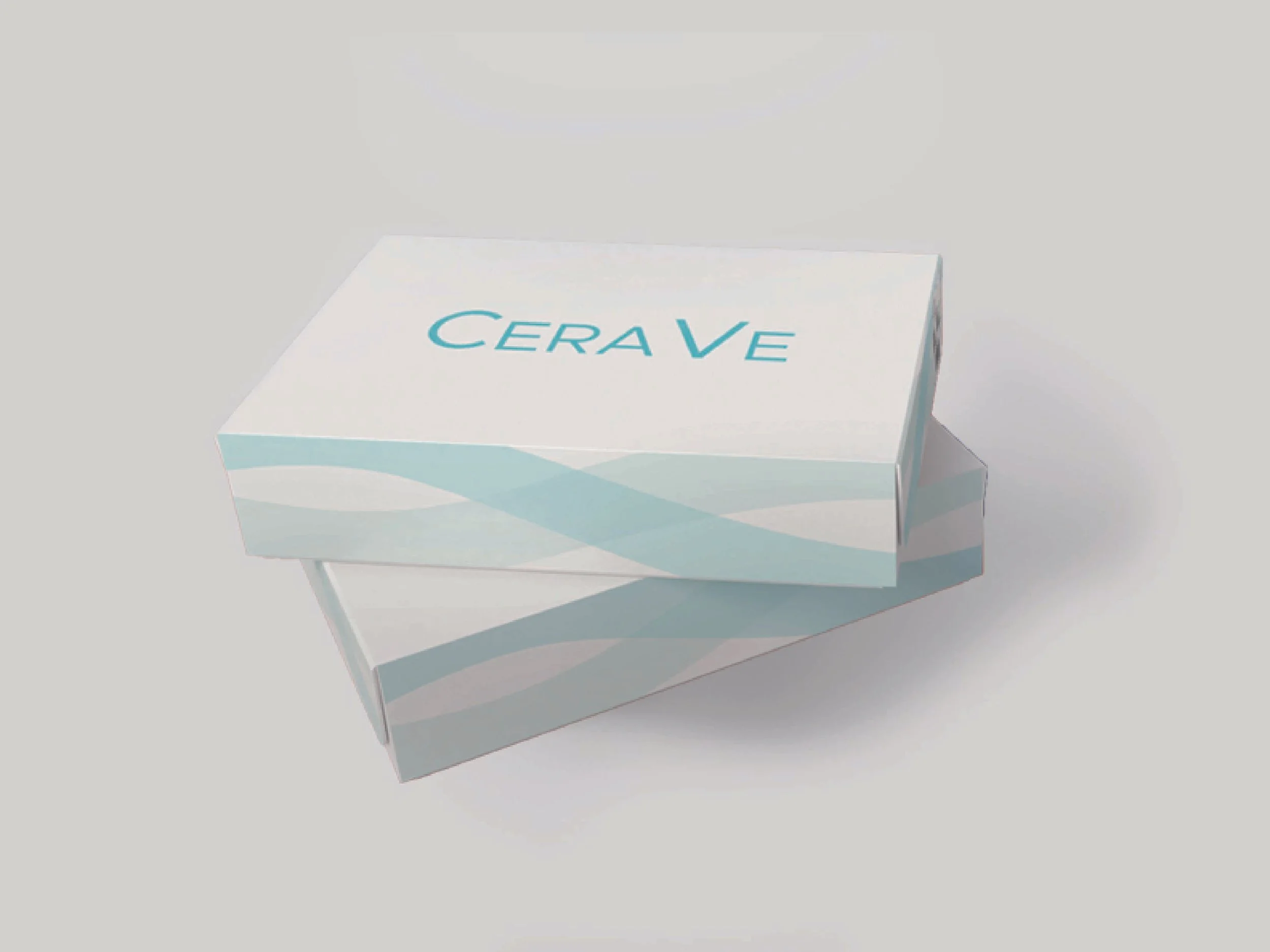
Pr Package
Sketches
Letterhead, envelope, & business CArd
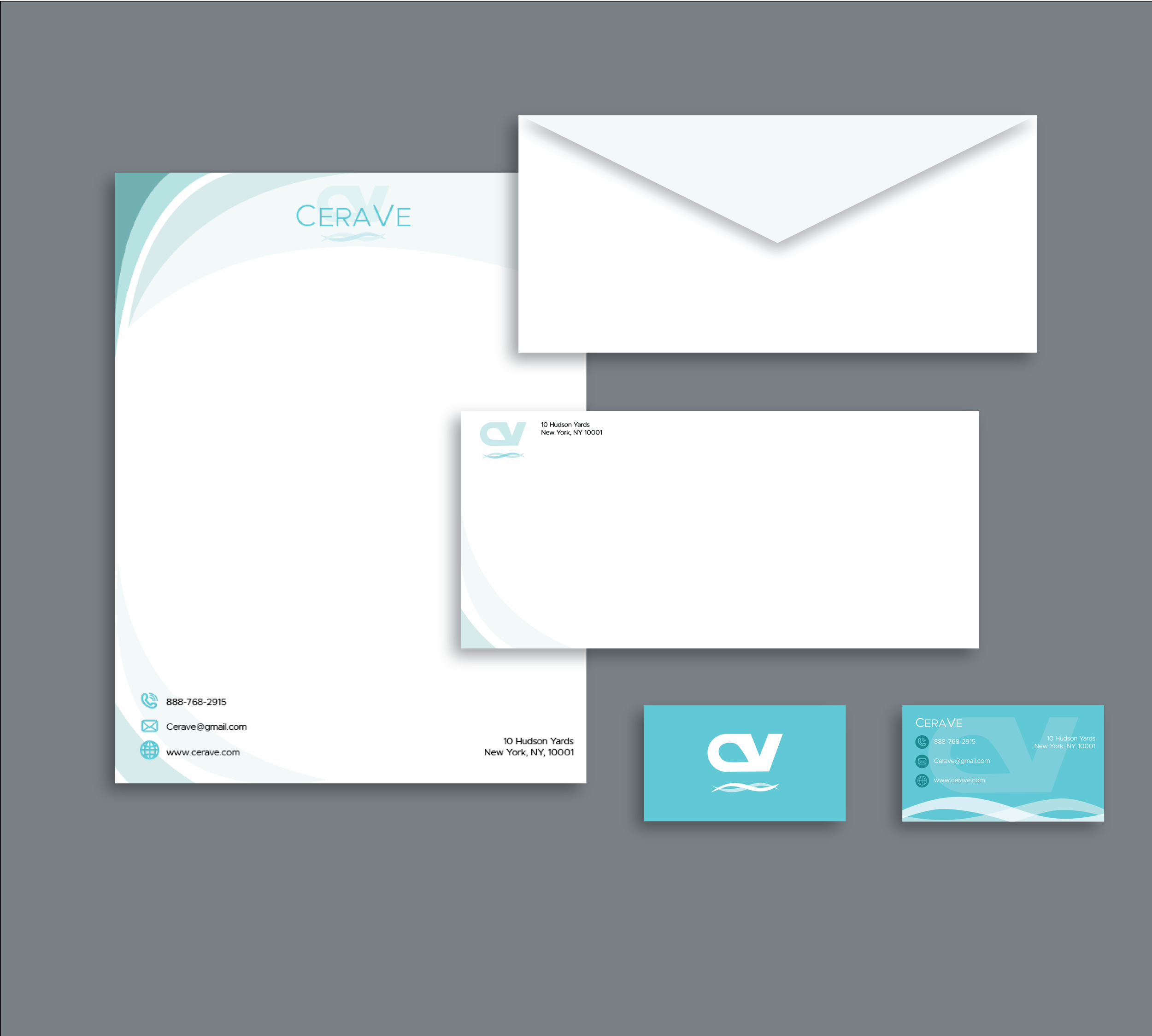
LETTERHEAD (8.5x11 in)
ENVELOPE (4.125x9.5 in)
BUSINESS CARD (3.5x2in)
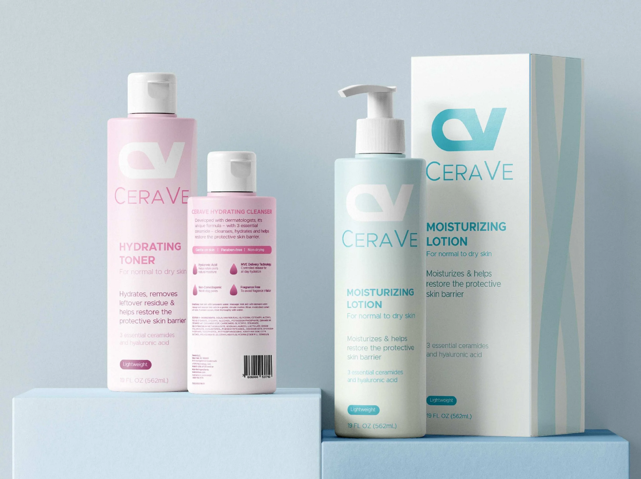
Products
PRODUCTS:
- HYDRATING TONER
- HYDRATING CLEANSER
- MOISTURIZING LOTION
Brochure
11" x 17"
Print Ads
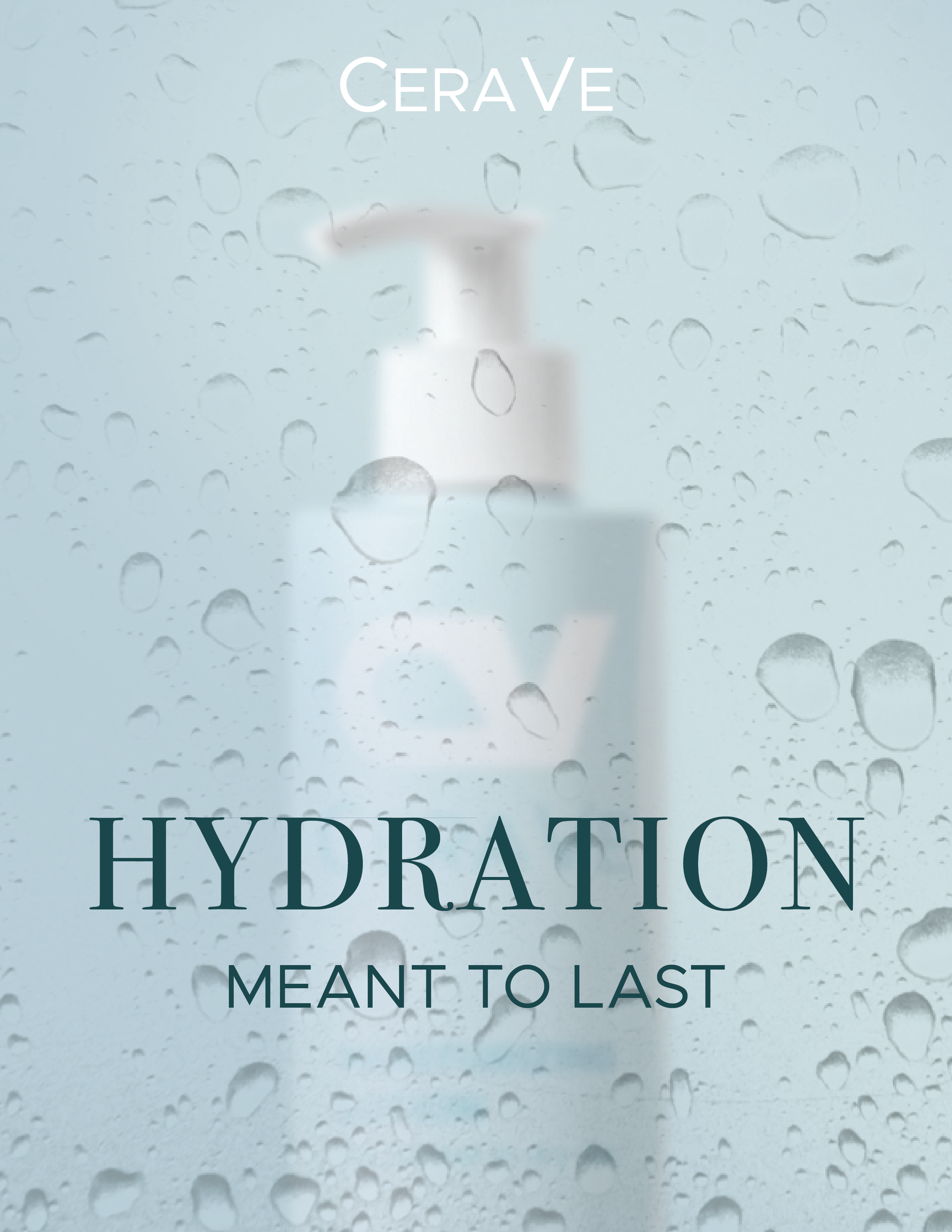
8.5" x 11"
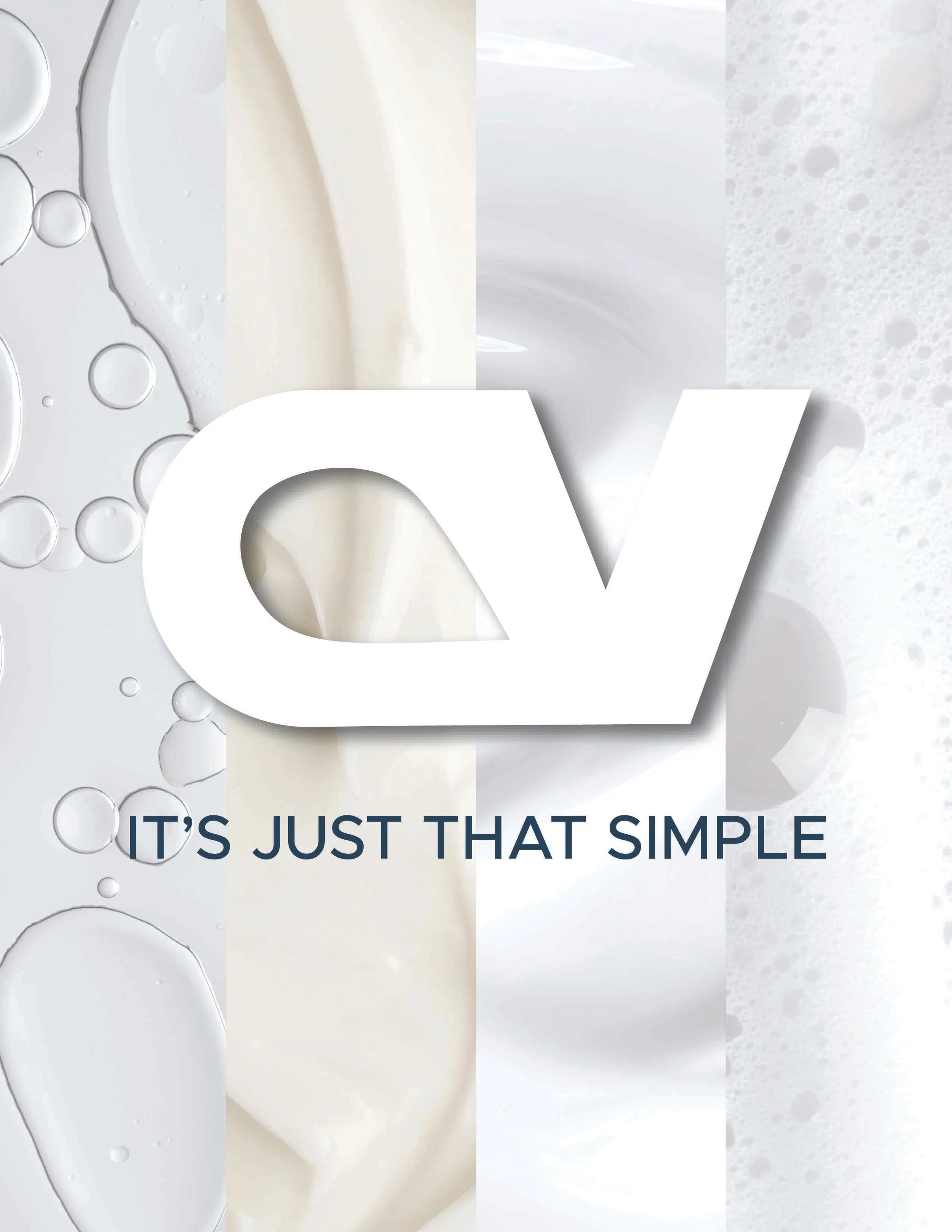
8" x 10"
PR Package